Not that long ago, the first impression a patron would have of a new venue was the warm smile of the host, or the aroma pouring through the front doors.
While I love old school service, and I try and let the food speak for itself, there is no denying the vital role in technology when it comes to consumers choosing the place to eat in 2015.
Over 80% of hungry diners search for Adelaide hospitality websites on their mobile devices, according to a study performed by SinglePlatform and research firm Chadwick Martin Bailey.
It’s more important than ever to have an attractive representation of your business on the web. More specifically, it’s paramount that your establishment is showcased well on the device your customers will be likely using, because 75% of respondents said they will often choose a restaurant based on their mobile search results.
Another interesting observation is that over 60% of customers are less likely to choose a restaurant if the menu isn’t able to be read clearly on this device.
Whether you own a restaurant, cafe, bar or burger joint in Adelaide, a website is now the front door.
While word of mouth is always critical for savvy eaters, people looking for a new restaurant or bar will- eight times out of ten- judge you based on what they see on their mobile device.
Your customers like to know you care about them, and they like life to be made easy for them.
If you own a restaurant, you wouldn’t expect them to come into the kitchen and get their own meal. Likewise, you shouldn’t make them jump through hoops to read a menu.
You should have a Facebook page. It’s a great way of interacting with your customers, but it’s not enough. Your customer shouldn’t feel obliged to use social media to view your page, and it’s not a particularly original way to showcase your products.
There are many cheap formulas online to help you build your own hospitality website, or pick from a bunch of designs. You can use systems online which take orders and payment. The cost of this service is that you’re unlikely to stand out among the crowd.
In appreciation of Adelaide hospitality venues which have delicious food, great drinks and a cool vibe, I’ve compiled a list of establishments which represent their brand properly on the web. It’s not a list based purely on best web design practice, I’ve taken into account the story portrayed, the photographs taken, and the originality of the page. I have definitely missed many, but these are some that come to mind over the last few months.
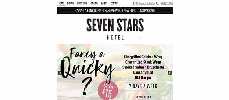
The Seven Stars
Basically black and white until you hit the images after a little scroll. Good contrast.
Kutchi Deli Parwana
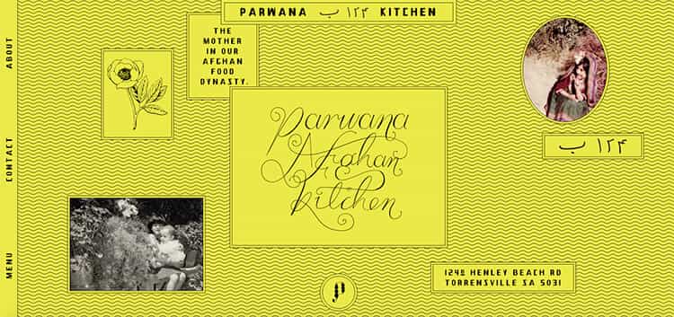
Kutchi Deli Parwana boasts an eye catching, colourful website with some outstanding photography. It’s responsive, loads fast and starts making my tummy rumble.
Andre’s Cucina
Simple, elegant and almost understated, this site provides me with all the information I need to book my next Menu Fisso.

Golden Boy
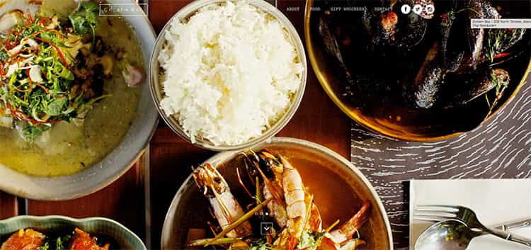
Golden Boy utilises current trends with a twist. The food photography is endearing, and the sketches add a cool effect.
Jarmer’s Kitchen
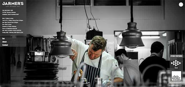
The website for Jarmer’s Kitchen showcases the head chef and staff using great photography. The design of the overall website is simple and clean.
The Greek
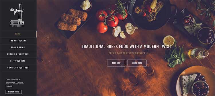
The Greek’s website doesn’t blow you out of your socks with any crazy parallax scrolling or over the top animations, it’s just a well put together restaurant site, which I can only assume is what the client was after.
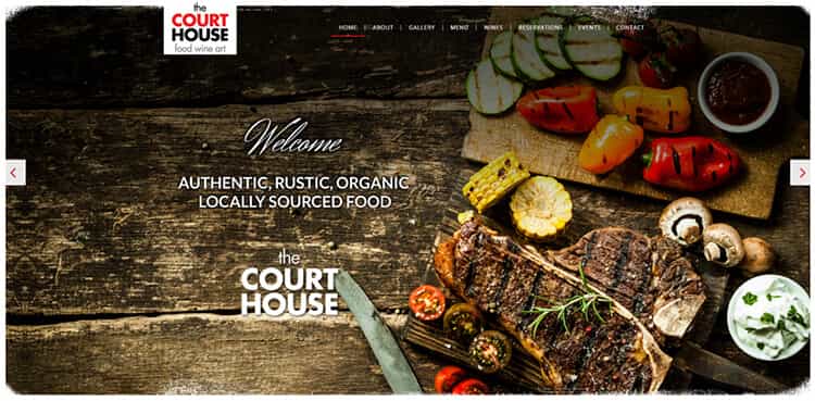
The Courthouse, Normanville
Yum. Someone did their homework for this site. Photography is on point, the use of text and images is on point. They accurately convey the atmosphere of dining in this joint. Good effort.
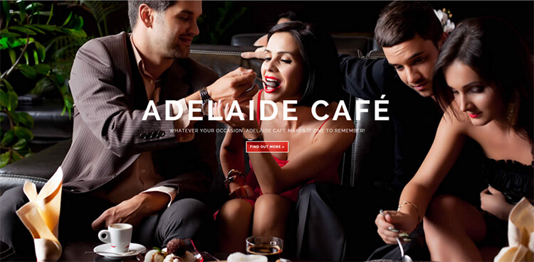
The Adelaide Cafe
adelaidecafe.com
An example of using good photography to set the tone and market to a specific audience. Simple design with an engaging background image.
Burgastronomy
burgastronomy.com.au
I could almost dedicate a whole post to the web design of the new burger bars. I’ll start off with Burgastronomy. Love the background image. It serves its purpose well.

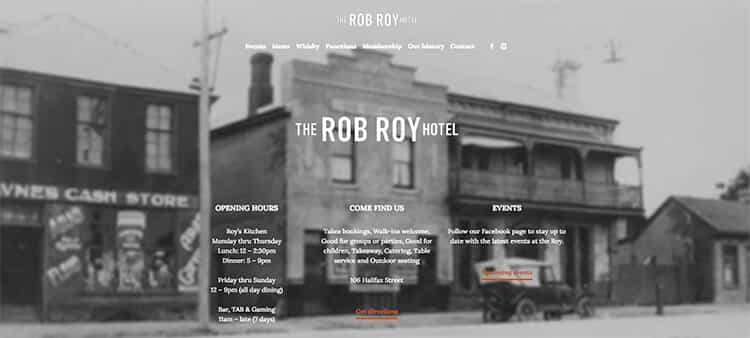
The Rob Roy Hotel
It’s good to see a family owned hotel at the top of the list when it comes to getting their point across on a website. An easy enough site to navigate with a good platform for advertising current events.
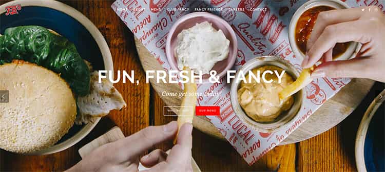
Fancy Burger
studioalumni.com.au/Fancyburger/
I have no idea what’s going on with the url for this site, but their burgers are fricking awesome, and their site is on par. Really easy to use, looks great, makes me hungry. During a working bee in blackwood last week, I had three burgers in a day during their half price sale. I’m open about this kind of stuff. Judge me, go on.
Goodlife Pizza
I’ve been to Goodlife Pizza a couple of times now, and I’ve gotta say, this website reflects what their company are about. Their website translates so well that they literally allow you a virtual tour of the shop. Really cool.

Cliche
You’d expect an art gallery/ eatery to have a good handle on composition and design. Yep, no surprises here. Nice little website showcasing what they have to offer.

Honorable mentions
Jack Ruby
jackruby.com.au
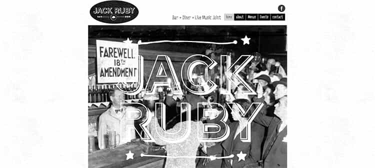
I love the old school, cool feel to this site. We can’t help but feel that the button to click for a PDF probably isn’t needed, and they have inconsistent use of capital letters on their home page. Love the design though!
Jasmin Indian
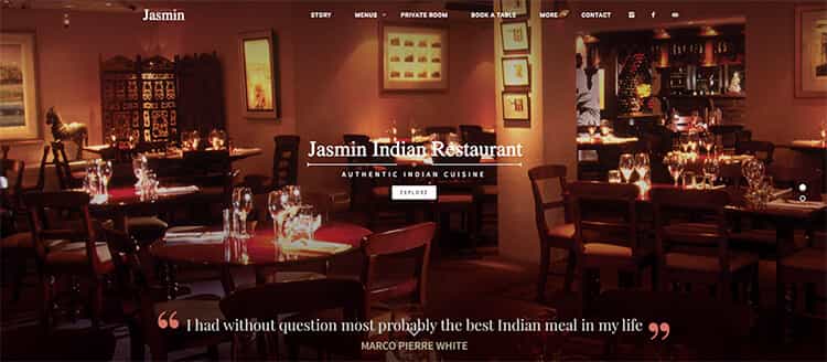
Much like the toasty atmosphere you’re likely to experience when dining at Jasmine, their website uses a warm colour scheme, accurately depicting their story with friendly pictures of their staff. It’s inviting, taste bud inducing and professional. I reckon it could probably use some new fonts though as the overall feel is a bit dated.
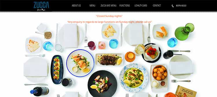
Zucca
I just love the image on the first page on this site. It’s enough to get you excited and I think it’s enough to set the scene of their establishment. What lets them down is the rest of the site. It doesn’t seem to be thought out properly as soon as you click past the first page.
