

Coding techniques have come a long way in the past few years. Gone are the days of Flash websites (that didn’t always work on your computer). Welcome to a time where you can any animation, transitions and other forms of movement with CSS and a touch of Javascript.
These are 8 websites that I think know what they’re doing. While a lot of designs take the direction of using EVERY POSSIBLE ANIMATION TECHNIQUE, I think less is more. The following websites use animation subtly and usually in a way that improves User Experience and most likely sales for the business behind the website. Scroll down further to see what not to do!
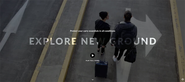
This page on the Bellroy website shows a great example of Cinemagraphs, still photographs with minor, repeating movement. While looking great aesthetically, it also provides a visual of the product in situ, in various types of weather. If you scroll down further on the page, the fade-in on the text give the website a soft, organic feeling as the user browses through.
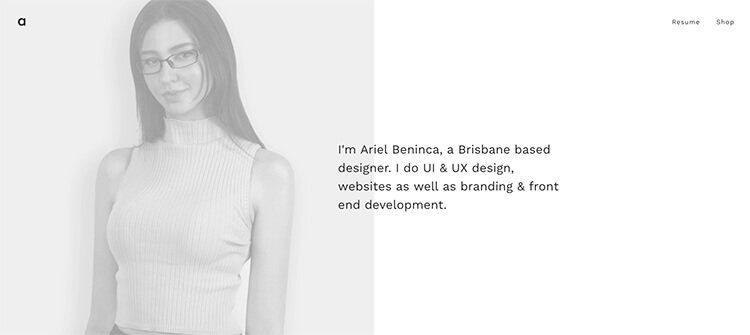
Ariel Beninca:
This girl knows where it’s at when it comes to movement and UX. From the slight animation in the top slider that follows the user’s mouse, to the subtle hovers, she has made the experience pleasant for the user. While she has used a lot of animation, it is all soft, slow and subtle, so it works and is fun to use.
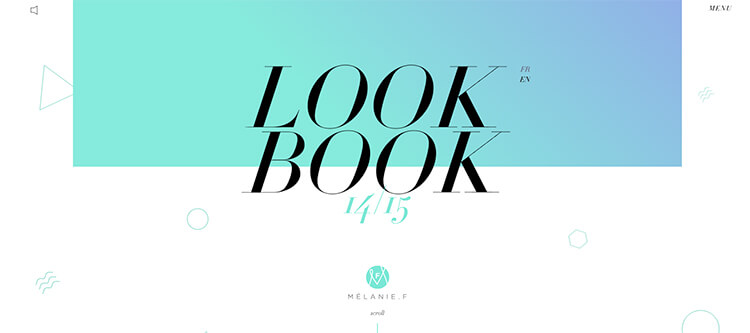
Melanie F:
The slow movement of the little shapes on this website are mesmerising. They are constantly moving but it is slow enough and they ares small enough that it doesn’t detract from the rest of the website design. In fact, they complement it as they change colour for each section to match. The entry animation of the display text seems to really bring out the use of typography.
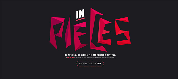
In Pieces:
http://species-in-pieces.com/#
I absolutely love this website. It is minimalist and shows off the beauty of the species the site was made to highlight. The lack of text focuses the user’s attention on the animated section and the slow, simple animation makes for an enjoyable browsing experience. Even the moving texture on the text adds to the feeling of tangibility on this website.
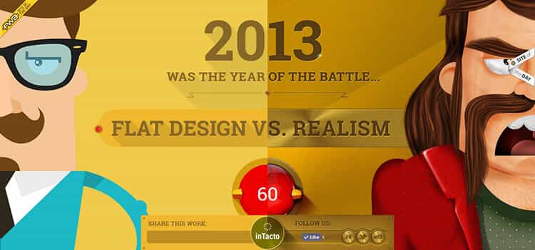
Flat VS Realism
If you read nothing else on this blog, check out this website. It uses HTML5 and CSS to create a hugely engaging, interactive experience. We have a long, parallax story, a game and a video at the end all controlled by your mouse. Must have taken a while!!
Shwood:
https://www.shwoodshop.com/au/canby/walnut/grey
This website doesn’t actually use much animation, which isn’t necessarily a bad thing as the large images really steal the show. The part I like is the use if video to show off the sunglasses. This page has a full-width video that engages you and really just makes you want to buy the sunnies!

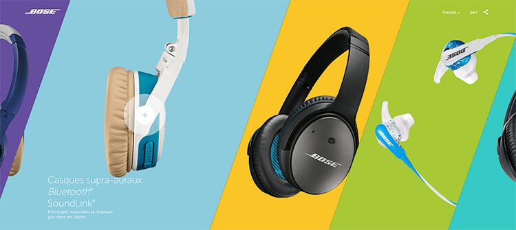
Bose:
This Bose website is a great example of using movement to indicate what the user is looking at and doing. When the user hovers on a box on the first screen, the headphones come forward and take up more of the screen. When you click on the headphones, the box opens further and you find yourself on a page with more information about those headphones. Soft animations and interactive elements as you scroll through this page make for an engaging experience and the animations are not over-the-top.
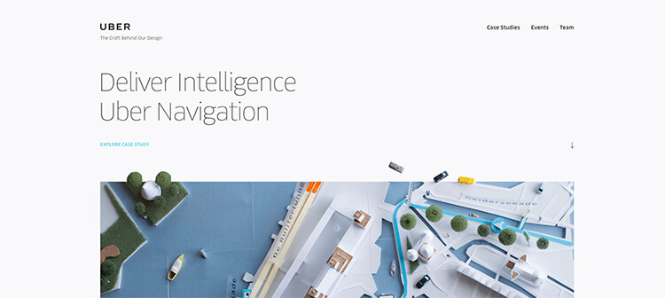
Uber:
The designer of this website understands that animation needs to feel like it is a part of the site, so it doesn’t stand out too much. On the first page, the movement is more of a design feature than functionality. Jump into the guide page and zoom movement is used when the user hovers on an image. It looks good and is useful as it brings the images closer when they are being viewed, The website is also filled with soft transitions making for a pleasant experience.
What not to do
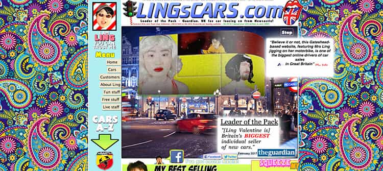
Ling’s Cars:
Well, it seems that sometimes going over the top with animation and colour work in your favour… kinda…
Less is definitely more! The websites using minimalist animation to complement design or show off a product know what they’re doing. Use movement to let the user know where they are or where they are going. Use it to emphasise. Don’t just get excited with multiple animations and overwhelm the user. Even more than one animation happening at once is too much. Have a look at YOUR website and have a think – is that animation really improving user experience?