

When designing a website or app, it’s important to ensure that those with accessibility issues are not overlooked. Making sure your website is accessible to everybody and anybody will drastically improve the overall user experience. Here are a few ways you can make your own website a little more accessible.
Contrast
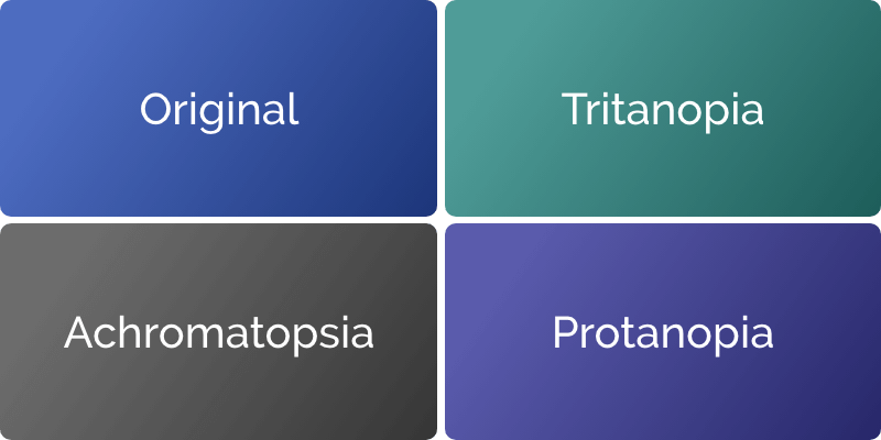
Colour blindness affects 4.5% of the total population. Making sure the content on your website is easily readable can make a big difference to your visitors!
Do make sure your design passes the WCAG 2.0 AA readability standards, which means that the text stands out from the background enough that anybody could easily read it. Check out Colour Contrast Checker to test your colours!
Don’t try to measure readailtity by eye, as visitor won’t necessarily see colours in the same way you do.
Content
One of the biggest issues I’ve noticed online is poor content delivery. People tend to write A LOT about their business and products, this is understandable as they are trying to sell themselves but in reality, visitors just aren’t going to read it all.
Do keep your copy short, concise and to the point!
Don’t fill your website with pages of laborious content. The more text you add, the less impact it will have.
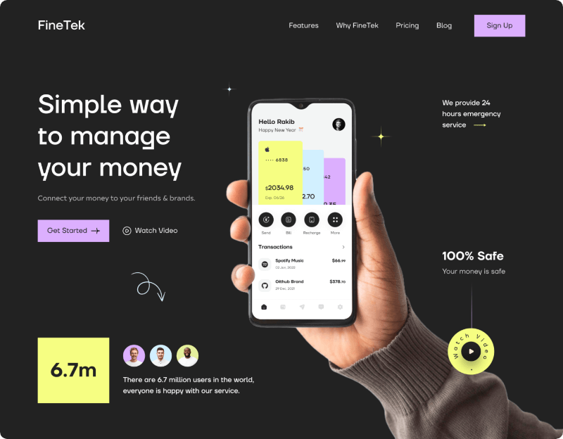
An example of content being broken up and presented in an interesting way by Rakib Kowshar.
Size does matter
It’s fun to experiment with font size when using typography as a graphic element. But, when it comes to information that you want your visitors to actually read, we’d suggest making it as easy as possible for them. Depending on the font used, I won’t drop body text below 14px on desktop and around 16px on mobile. It’s important to remember that just because you can easily read it, doesn’t mean everybody can.
Do make your font big enough to read, usually around a minimum of 14px on desktop and 16px on mobile.
Don’t assume that everybody’s eyesight is as good as yours.
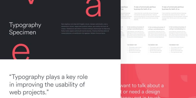
By Stefano Peschiera.
Mobile Optimisation
More people are accessing the web from mobile devices than ever before! A functional desktop website is no longer enough. Here at Digital Noir, we’re working to make clunky mobile websites a thing of the past. Small adjustments to spacing, font size and menu navigation can often make the world of difference on mobile sites.
Do consider how your designs will respond to different screen sizes as you create them.
Don’t treat responsive design as an afterthought.
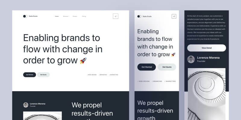
By Wildan Wari.
Do you want to check the readability and performance of your website?
Check out our ‘Website CheckUp’ which analyses your website readability, but also its overall effectiveness and user experience. You’ll receive a detailed report and recommendations for fast improvements.