The Raw Numbers
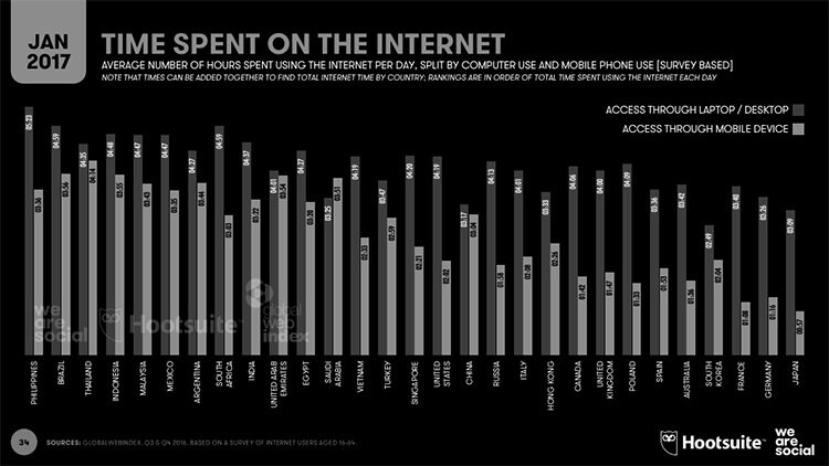
People love their phones, research has found 60% of people agreed it was the most significant consumer invention of the century.
Mobile now represents 65% of digital media time, while the desktop is becoming a “secondary touch point” for an increasing number of digital users.
Look at these stats, look at it!

Allow Me To Introduce ‘Mobile First’
With the great rise in mobile consumption with smart mobile devices, I’ve become quite familiar with ‘Responsive Design’ as a graphic designer. It’s ‘the approach to web design aimed at allowing desktop webpages to be viewed in response to the size of the screen one is viewing with.’
You start big for desktop computers and then you reduce down to smaller devices. However, given the overwhelming evidence of mobile usage, there’s obviously a lot of logic behind a reform going from small to large instead.
That reform is ‘Mobile First’, and it’s not new! Google have been officially doing it since 2010.
The mobile-first approach is the ideology that mobile design, as the hardest and more important, should be done first. Once the mobile design questions are answered, designing for other devices will be easier.
Why Mobile First is The Winner
I must be honest, personally I prefer starting my design on the larger desktop size, but, when you start with the desktop platform, you tend to want to take advantage of everything that larger space has to offer. You design an amazing website that has awesome animation, slick mouse hovers and negative space…. only to realize that none of it scales well down to mobile. This can and does lead to severely watered down mobile products that feel more like an afterthought rather than a polished, finished product.
More importantly, starting with Mobile, you’ve already gone through the problem of trimming down the content to its most contextually essential. Now when it’s time to bring this design up to the desktop, instead of facing the dilemma of what to cut out and what to keep, you instead get to decide how to make it even more robust.
Mobile First Is Not All Sunshine and Rainbows
“Change is hard at first, messy in the middle and gorgeous at the end.”
I’ll have to admit it, for me designing ‘mobile first’ is tricky. As a graphic designer who’s been designing for desktop first for years, the switch was a big one. Staring at a pint size canvas feels like I’m staring at a brick wall at times, but change takes time. Planning and wireframing become even more crucial now, and the use of OOUX is hugely beneficial.
This ‘change’ also affects the clients. In presentation meetings, first impressions and client expectations are always high. Unveiling a grand design on a 5 inch screen usually doesn’t leave the room in awe. A majority of clients still prefer to look at desktop design before mobile, some don’t even glance at the mobile versions.
Of course, I’m nit picking with these negatives and I believe that in time these two points will be out of the picture.
Embracing The Pocket Generation
Someone once said “If we fail to adapt, we fail to move forward” and that’s true, even for a designer’s desktop. To design mobile first, you need be able to test it in real-time. Too many times I’ve designed something and the text is too small to read, or the ‘Add To Cart’ is below the first viewport. Things I could have easily avoided with this setup.
It’s super easy with Adobe Preview, you can check usability and text sizes in real time as you’re designing for mobile. I think every designer now, should have a setup like this or something similar, sure you could scale the design on your desktop to the size of a mobile screen but nothing beats looking at designs on the real thing! How it’s meant to be viewed and interacted with.

What do you think about Mobile First? If you’re a designer, what does your setup look like? Hit us up and let us know.


