

Do you watch Youtube ads? Or do you hover your finger over the skip button eagerly awaiting for the five-second timer to end?
In my opinion, advertisements have become dull and lifeless. I often find myself ignoring them or even avoiding them completely, and I’m obviously not the only one. Spotify, Youtube and many other services offer an ad-free experience for the right price.
Ads are getting smarter, they try to disguise themselves as other forms of media to entice our attention, they can also be directed towards a very specific audience based on their interests or internet search history.
Why vintage ads?
Advertisements used to be fun, full of life, risky and sometimes a little wacky. I wasn’t alive to enjoy the advertising trends of the 1900s (give or take a decade), but I still enjoy taking a look back for some inspiration. Here are a few vintage advertising design styles I’d love to see make a comeback!
The Illustrations
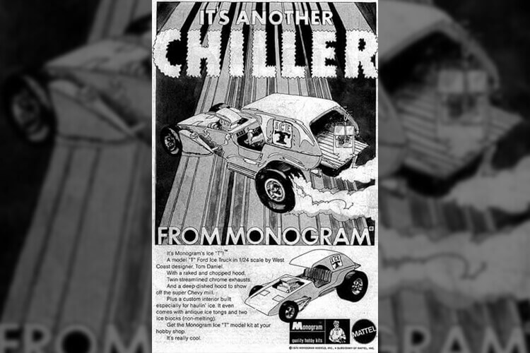
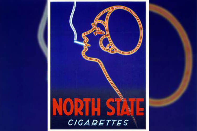
There is something about old school illustrated advertisements that catches my eye. It might be the detail and intensity of the images, or the passion and love that looks to have gone into creating it. Creating an advert by hand would be no easy task, the art of this technique has become redundant now that we have photography and computer-generated imagery. I tip my hat the artists who could sell a product with a pencil and piece of paper.
The Loveable Mascots
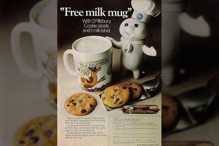
These days we have the Meerkat from Compare the Market, or the Dodo from well, Dodo. Gone are the days of being greeted by Pillsbury Doughboy or Frosted Flakes Tony the Tiger. Vintage mascots were likeable, they gave their brands personality and told stories. Today mascots function in the same way, but I find they’re much less memorable. Something about a realistic looking Meerkat in a robe feels strange, I don’t want to watch him.
The Risky
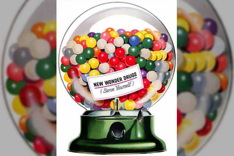
Today, there is no way you would see a commercial that referred to candy as a ‘wonder drug”, but anything was fair game back in the 1950s. Advertising towards children has changed; not only because of advertising regulations being introduced but because we’re overprotective of them. It’s understandable, the world doesn’t feel as safe as it once did. I’d love to see the return of precarious wording in advertising.
The Weird
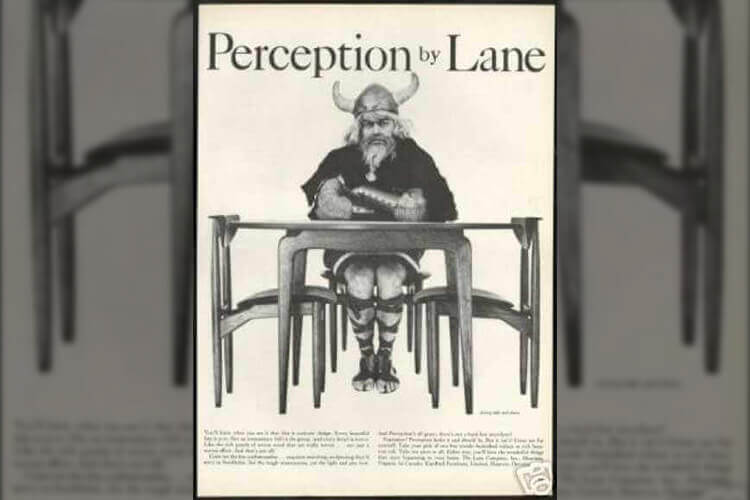
In the 1950s, Perception by Lane chose to advertise their furniture by showing a Viking sitting at their table. It doesn’t make sense, I can’t find any meaning to it, but I love it. It’s zany and unexpected and sure beats a dude screaming at the camera while showing you around his warehouse full of discounted sofas.
The Colours
This is subjective, but I miss the retro colour palettes. Somewhere throughout this golden age of advertising, colour printing was established, and they went hard! Colours were vibrant, saturated, and everywhere. Of course, I can appreciate the photography and white space used in advertisements today, but there is something so striking about vibrant colours that is hard to replicate in any other way.