What’s the first natural thing you do when you open an app most of the time? You scroll. Vertically. But in the last few years, there has been a shift. With more and more features and information being added to apps, something had to give. Believe it or not, there is such a thing as too much vertical scrolling.
Enter the horizontal scroll.
Here are some great examples of horizontal scrolling in apps.
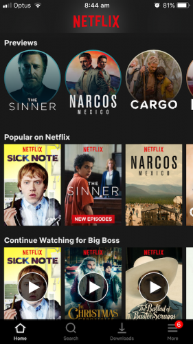
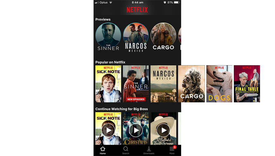
Netflix Mobile App
The Netflix mobile experience is primarily focussed on the horizontal scroll method. With so many shows and movies now (over 60 original shows and movies debuting in October this year alone!), the user experience of navigating all these choices is crucial to users. This is where the horizontal scroll is used so well, users are able to browse through multiple categories of entertainment without ever leaving the home screen. It’s also very obvious to that user that they need to scroll using the peep out method, teasing the next item in the row to prompt a side to side swipe.
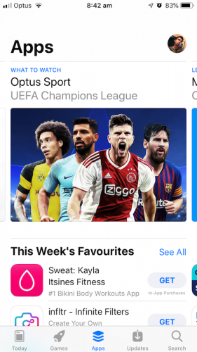
The iOS app store has also used a similar philosophy, with so many apps competing for space, the horizontal scroll is crucial to the user experience in 2018.
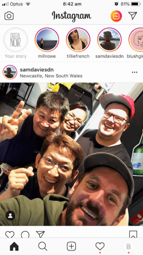
With the introduction of Stories to Instagram and Facebook, they needed a way for these Stories to be at the front and centre to get their users’ attention. Again, the horizontal scroll is utilised brilliantly here. Users can quickly check the latest stories before starting the journey down the feed…vertically.
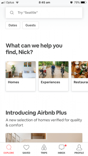
Airbnb has introduced more services, outside of accommodation, since their launch. Users can access these services easily without the sacrifice of pushing other key content further down the page.
Horizontal scroll in app design is in full swing, with companies adding more and more content and features to their apps, easy access to content needs to be clear to all user. We’ve continued to dive deeper into the three spatial dimensions, we started with (Y) vertical scrolling, seamlessly added (X) horizontal scrolling. Is the next horizon going mainstream with (Z) 3D touch or long press to quickly view information?
Let us know your thoughts on app design…we love to chat!


