

Last month, I spent a week in Melbourne attending an intensive user experience design course at General Assembly. Emphasis on design being that of functionality, not colours and graphics. It was fun to live the big city life for a moment, maybe I’ll write a blog about all the great food I ate later. For now, I’ll focus on the course. So, what exactly is user experience design? I think Jesse James Garrett explains it best. UX is:
“the design of anything independent of medium or across media, with human experience as an explicit outcome and human engagement as an explicit goal.”
User Design processes can be applied across many professions and situations. As a graphic designer, the processes are useful for fine-tuning my own problem-solving skills and delving deep into creative solutioning. Though ‘UX designer’ is a profession in itself, it doesn’t mean you can’t become somewhat multi-disciplinary.
Here are my top takeaways from General Assembly’s UX Design course:
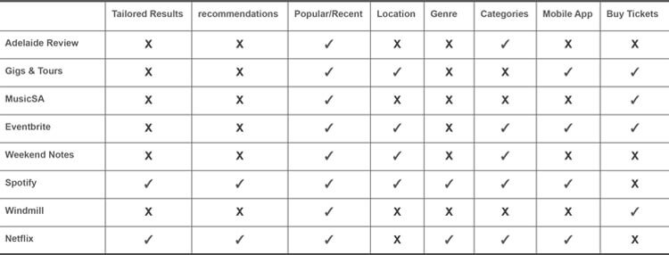
1. Competitive Analysis
What better way to get started than to look at what others are doing. If you’re trying to design a solution to a problem, comparing several competitors in a visual way allows you to identify gaps in the market and functionality that could be implemented into your solution which you hadn’t previously considered.
2. Contextual Inquiry
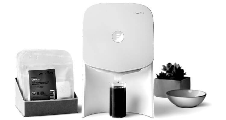
Assumptions are dangerous, just look at Juicero, A $400 juicer that only worked when it was connected to WiFi and refused to juice anything that wasn’t in an official Juicero pre-cut fruit or vegetable package. A $120 million project that completely flopped. As it turns out, people didn’t want to use a juicer that had so many bizarre restrictions. If only Juicero had gone out and asked their potential users what their juicing needs actually were, they probably could have avoided this catastrophe.
Don’t make assumptions about what your audience needs, you’ll always produce better results if you ask questions.
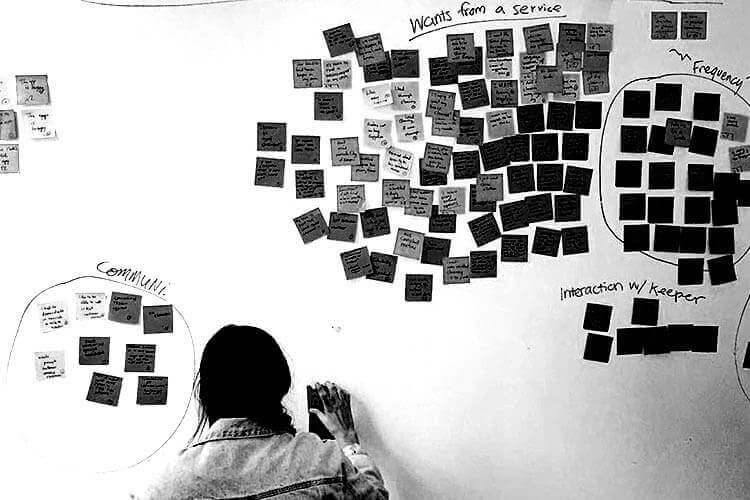
3. Affinity Mapping
After you’ve asked questions, you’ll have a lot of answers to process, way too many to sort mentally. Affinity Mapping is a visual tool used to combine like answers into groups, so you can condense the wealth of information into something tangible. We’ve used the same process here at DN during our brand values workshop. Recording each piece of information on a sticky note will allow you to swap and change things around easily, as well as help you grasp the scope of information in a way you wouldn’t be able to digitally.
4. Personas
Including personas as part of your project or branding is a useful way to inspire empathy with your users’ needs and problems, as well as making sure you’re not casting too wide a net when targeting an audience. Here at DN, we produce a lot of content. We have a regularly updated podcast channel, newsletters and weekly blog posts. Having personas in our office helps us remember who we’re talking to when creating content, and it allows us to understand our audiences needs, interests and frustrations.
Sure, there are sometimes drawbacks when it comes to using personas. This article from InVision does a good job of explaining why, but if you have a good understanding of your user base and create your personas based on that, they can be effective marketing tools.
5. UX and UI
In my field, user experience design and user interface design are often used interchangeably or pitted against each other. General Assembly had an analogy for the difference between these terms, it went something like this: A glass ketchup bottle has working UI. It stores and preserves the sauce. It does everything it’s supposed to do. But what happens when you reach the end of the bottle? Maybe you’re shaking the bottle? Banging it on a countertop? Getting that last bit of sauce out of the bottle is a total pain. This is where UX design comes in.
UX design takes your experience into account…it knows you’re struggling with the glass ketchup bottle, and so it presents the squeezy bottle! It does exactly the same thing as the glass bottle but is much more intuitive and pleasing for the user.
So, did the original creators of ketchup bottles disregard the user experience? It’s more likely that they were just restricted by the technological production limitations of the time. The problem with this analogy is that it pits these two terms against each other. UX and UI are not interchangeable, but they are also not opposites. They can’t live independently, they work in tandem together. The user interface is a part of the user experience.
Wrapping it up
My takeaways in a nutshell: research your user base, get to know your audience. Don’t make assumptions about them, but instead get to know their needs and pain points, and use these to create personas you can reference when creating products or content. Look at your competitors, what are they doing that you’re not? What are they missing that you could use? Your content will be better off for it.
Need some extra help with content creation? Get in touch