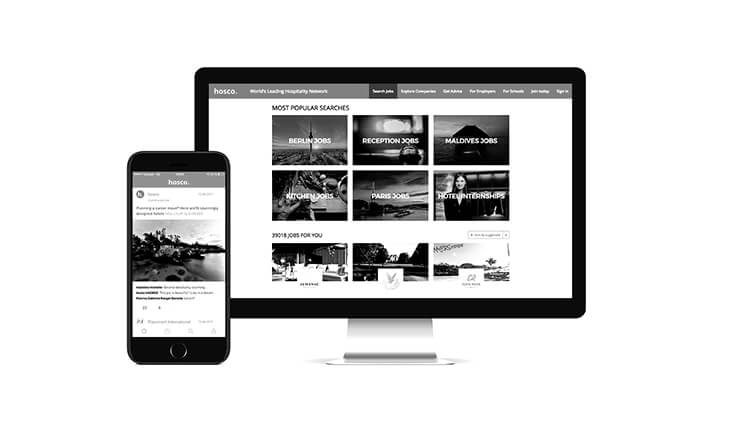
A couple of weeks ago, I spent some time talking / thinking about the realities of mobile websites in 2017. After having just spent a weekend touring the wine country north of Adelaide, my convictions are even stronger.
Dear business owner, let me set the scene.
A tourist has landed in your city. They have hired a car and set off on an adventure north of the city to explore the wine regions. They have done some prior research for the trip but have left quite a lot yet to be decided. For example:
- Which wineries to visit on Tuesday
- Booking a wine tour
- Booking lunch and dinner for Wednesday
- Booking accommodation for Wednesday night
- Researching a golf course to play Friday, and booking
- Looking for good shopping areas for local gifts
- Where the hire car can be returned closer to the airport

This is a pretty standard set of tasks that any tourist would do on a short trip and all of them will be done VIA MOBILE PHONE.
I am now speaking from experience and I found the following that on a 4 day mini-break.
- Only 60% of the sites I visited were actually mobile friendly
- Only 5% of the ones that were, were actually intuitive to use
The tasks I wanted to complete were simple. Mostly checking menus or opening times. The content strategy of most of the sites I visited appeared to be non-existent. There had not been enough thought put into WHY things should be placed in certain areas of the screen. Nor HOW a user would approach navigating the content.
Some of the issues I ran across on the sites that were responsive were:
- No easy to read phone number or contact details
- Booking section not setup for easy use on mobile
- Opening hours hidden away in a non-intuitive page
- Popups that are impossible to close
- Buttons that get in the way of scrolling that cause you to click and lose the path you were on
- Large non-optimised images
- Hard to read copy
Honestly, a smarter strategy for 90% of these sites would be to have a single page design that has
- Logo
- Introduction Text
- Phone Number (and hyperlink to call)
- Opening Hours
- Links to reviews
That is all I needed in most cases. Instead I was being served large images and testimonials and special offers and etc etc etc.
These problems do not stem from the platform itself, they stem from web designers not paying any attention to what their clients users are actually going to be looking for. It is the role of a web designer / developer to educate the client in content strategy and elicit the information they need to create an experience that is going to fulfil their users demands.
This is 100% the difference between me choosing to stay at your hotel or eat at your restaurant. Sitting in my car pulled over on the highway I am going to be much more likely to be sold on clear, semantic information that I am by fancy design or photography. (put the two together in a seamless way, well that is even better!)
It seems we have a VERY long way to go in our industry and very little time in which to implement as the small screen revolution is already behind us!


