

Web Design Trends 2015
Do you remember in the 90’s, when it was cool to have a hit-counter, in flames, at the bottom of the page? Yeah you do. What about those amazing bouncing words behind the text of the same colour, which in some cases probably caused brain injuries to prospective customers? I’m not ashamed to admit using Geocities to ‘build’ my first website as a 15 year old. Back then it was awesome.
What I’ve found interesting is that in some ways, we’ve reverted back to the old web design trends in 2015. Just like a couple of years ago, flares came back into fashion; web design in a more subtle way, has had a small, but subtle cycle.
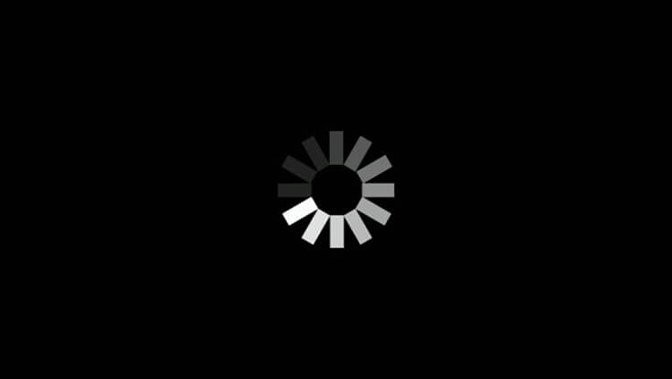
Loading Screens
Look at loading screens for example. Considered taboo a few years ago, they’re making strides at returning in full force as a feature! It wasn’t that long ago, given an Australian internet connection and a PC which would start to shudder at the mere mention of a flash site, you’d reach a loading screen and click the back button instantly.
Websites like this lost out to more informative, faster loading pages.
These days loading pages/icons can pass as a feature with a few conditions;
• Loading times still have to be reasonable
• There HAS to be something to keep a potential customer engaged during the process
• The content better be worth the wait!
Scrolling
One morning a while ago I woke up, got my coffee and fired up Chrome. All of a sudden everyone decided that scrolling was cool again. I waited for it to fade, but eventually I had to start knocking on people’s doors to make sure they had a scroll wheel, otherwise the internet wasn’t going to work for them anymore.
The trend of parallax scrolling is easier on the eyes than the 32 kilometre wall of text your local council used (or may still use) on their website in early 2000’s. Laid out correctly, this is a really cool way to develop your site. Just don’t do it the way everyone else is, though. Make it something unique and relevant. These days it’s often hard to differentiate between the Google Docs sign up page and almost everything else on the web. It’s important to determine the use of a feature before you implement it. If you’re going to scroll, why are you going to scroll?
In 2015, there’s no doubt it’s all about enormous, minimalist websites. Big, centered fonts are not a new idea, but they’re back!
![]()
Flat Icons
Those flat icons that are trendier than plain tees are just begging to be clicked. Scrolling down the page, you’re impressed with how everything seems practical and relevant. You think to yourself, “We’ve come so far from hit counters, animated bananas and overflowing icons”- wait.
“Follow us on Twitter, Digg, YouTube, Vimeo, LinkedIn, GPS, Flickr, Photobucket, yelp!, TrueLocal,”.
Icons, icons as far as you can see.
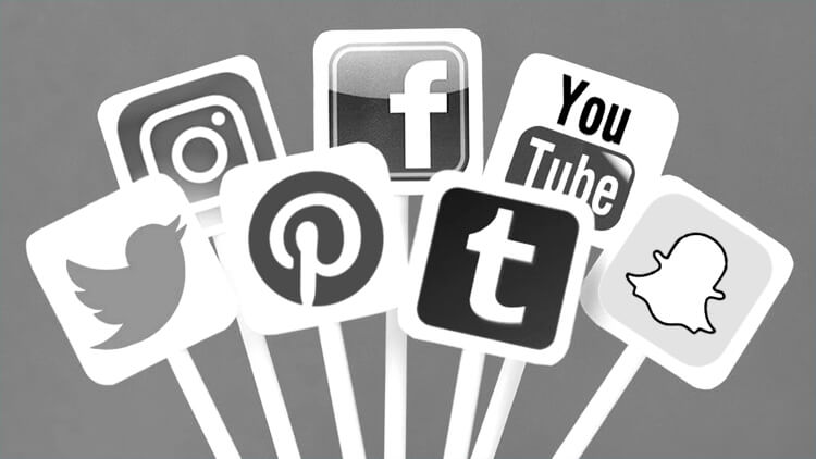
Social Media
Whoa Nelly! While social media is undoubtedly paramount in providing a progressive business with the tools it needs to stay in touch and compete, we all just need to relax a bit. Ask yourself whether or not you need to be attached to every possible social media platform on the planet.
Most websites will benefit strongly from having a Facebook presence. YouTube accounts are great for sharing ideas and showing that you’re a bunch of real people. Blogs are great because I need to justify what I’m doing right now in the office. Everything else should be tailored to how you want to be perceived. If you have justification for every social media account you’re signed up to, and it relates well to your business- then that’s perfect.
I dare say that a lot of what we’re seeing with crowded, social media button hangouts are to show your customers that you’re progressive and in tune with them.
When the customer goes to click on your Instagram account- and it’s a picture of your cat, you’re following 90 thousand people and are still waiting on the first like for Mr Tinkles, it doesn’t instill confidence in your customer.
Keep It Relevant
The point I’m trying to make here is that if you do link to an account, keep it active, relevant, and worthy of taking up space on your website.
This line of thinking should be equipped when looking for inspiration on your next web design. Keep it current, keep it engaging, but don’t follow a trend just to follow a trend.